 Colour is one of the more important factors when identifying allegiance in characters. Whist reading about read hierarchy of characters in a paper about Team Fortress 2 character design, I found out that colour was often used to distinguish between teams when a player is in close proximity to an ally or enemy.
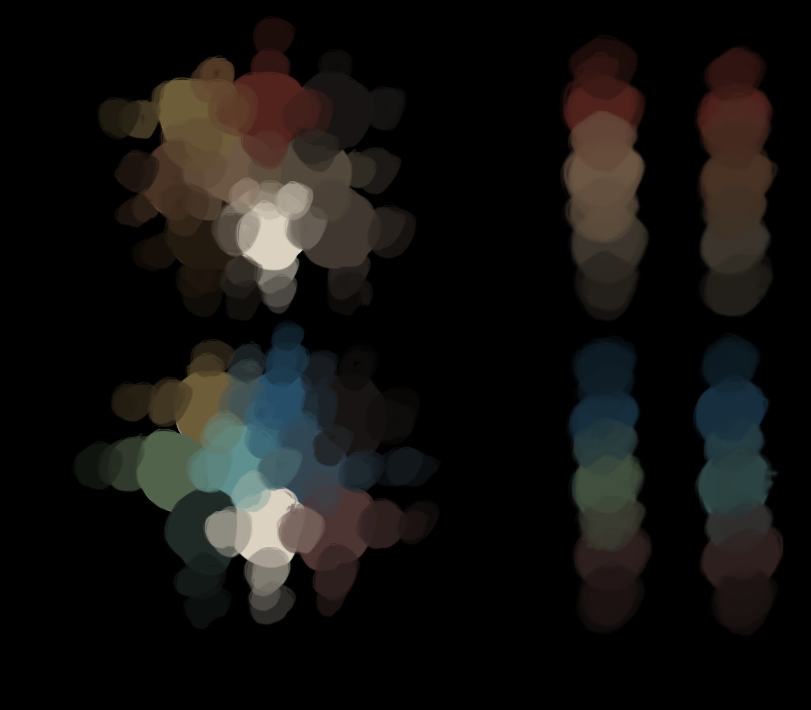
Though not having designed characters for the factions enemy team, it was important to start some colour tests to show that if an opposing team was encountered, it was easy to tell them apart.
 The 2 pallets I came to be satisfied with contained colours that both blended in, yet contained colours that stood apart from the others. With more arcade like games, strong, predominant team colours that often stood out from the background made the characters easy to see. However, aiming for a more realistic atmosphere, red team and blue team's colours were less obvious against the background so that they blend in, but were easily identifiable once seen. Both pallets contains organic colours from the environment, and some artificial colours. Some were shared between both palettes to show some kind of consistency so that they both seemed like they were from the same universe.
No comments:
Post a Comment