Monday, 13 May 2013
Personal Development Reflection
At the beginning of the year, I had been focused on producing highly detailed and well thought out 3D characters. It had been something that I had been wanting to achieve ever since my second year, however I was unable to achieve the standard I had wanted due to my lack of skill in certain areas of character design and creation. I was very good at much of the technical side of modelling in Maya, however, I was always afraid to pursue areas that I was unfamiliar with. This had left we with many detailed and unfinished works which I was unable to finish.
Influenced by the workflow of both industry artists and the CG community, it made me determined to see a highly detailed character from start to end.
2D Digital Art and Design
I observed the workflow of character creation, from the early stages of 2D design, to the final stages of posing and rendering, I was able to identify areas that I had to tackle in order to progress to finished characters. From the early stages of concept development, it was clear that, although I had many interesting designs that I had wanted to explore, it was difficult for me to communicate that visually before the modelling stage. 2D Digital Art was an area that I had to greatly improve on in order to visualize my thoughts. Not only did I have to improve my Photoshop skills, I had to learn the stages of the design process.
Throughout the first semester, I was able to improve on this through the creation of Silhouettes, Thumbnail sketches and concept paintings. Silhouettes were relatively easy for me, but thumbnail sketches were time consuming and difficult; the concept paintings even more so. Much of this was due to my difficulties with anatomy as my proportions were often very wrong. This work ended up accumulating into 2 highly detailed concept paintings for 2 of my initial characters at the end of the first semester. I was able to produce paintings faster, and to a higher quality than when I had started. I was able to visualize characters in more detail, whilst showing colour, which I rarely included in my 2D art before. My main notable change was my change in preference from creating concepts on a physical sketchbook, to creating designs digitally.
Anatomy
The development of characters also called for a high degree of anatomical correctness. I had been out of life drawing classes for a year, and many of my previous characters often had terrible proportions. I was able to improve on this throughout both semesters, initially through an ecorche study, and later on through further sculpts of my characters. I found that feedback from online sources and students helped find areas that seemed out of proportion with my character, and in turn, made it easier for me to identify anatomical problems better. Comparing the proportions with my initial low poly mesh with my final character, I can see a big improvement.
Texturing
The low poly modelling stages of the workflow was an area that I was very familiar with and I was fairly familiar with the high poly sculpting. However, when it came to texturing, and generating maps for my character, it was an area that I have had little experience with. I had stopped many of my projects before even reaching the texturing stage, so I felt as if I was walking into unexplored territory. Baking texture maps seemed relatively easy, though time consuming to get right. Getting the texture right on my first character was time consuming however, but as I moved on to the second, the process was a lot easier as I picked up a lot of techniques from the texturing of the first. Concept painting also helped me improve my painting skill, as well as work outside that i had done for the Samsung challenge making environments in 2D.
Rendering
The final part of the workflow, and a very important one if it came to presenting work, was the rendering stage. I had always been poor at rendering my work, often taking screen-caps and relying on Maya's viewport 2.0 to make models look nice. Finding a method to present my characters properly was important for me if I wanted to show then in my portfolio. I had always been interested in Marmoset toolbag, seeing highly skilled artists use it to generate amazing looking renders. However, it seemed incredibly complicated to me so I never got round to it. Fortunately enough, it was incredibly easy to use, which was why it was so popular. It also provided real time rendering which made the process very convenient which I loved as rendering had always seemed to cause lots of problems for me. In the end, although not learning how to generate nice renders in a traditional method such as rendering in Maya, I found a tool which was easy to learn which did it for me, designed specifically for the game characters I wanted to make.
Hair
The area was the section I had left till last, as every time I had worked on it, problems with alphas always occurred. I had tried to avoid this a lot by adding masks to my character designs, but in the end I decided it was something I needed to tackle. Problems still occurred when I attempted to get my hair rendered properly, but I was able to overcome these problems to finally have fairly decent looking hair in the end. Finally finding out how to overcome these problems, making hair is now a much easier task for me. A stage that I had always feared to tackle is now a more enjoyable task for me.
I am able to work through all areas of the character design process to end up designing, creating and presenting my characters in a very professional manner.
Initial business card designs

Expo prints


I cam thinking of having the patterns on the expo prints as well. They won't be as obtrusive like the examples above, and should hopefully blend in better with the back. This is my backup for if I can't get them to protrude out. I am also labeling them with the team name and logo to make them seem more official.
Expo layout 2.

A slightly simpler design for the showcase. The hexagons can be cut from paper, and the background is just plain white.
Expo layout 1.

I will need some kind of material to make the finished pieces protrude from the wall. I will somehow have to mount it to the wall so it will have to be light. I will probably do the same to the Logo and mount the labels for the characters too. I will also need a lot of dark grey paper to cover the background of the wall. I don't know what I am going to have the hexagons made out of, but I want them to be large and chunky, like in the models. Shiny if possible.
Preparing things for the Expo
How do I clearly communicate my ideas?
How can I communicate that my stand is about the creation of a team in a creative manner?
At first, I though of showing this through concept development sketches along with the final pieces. I would be able to show the process of creating a group aesthetic through media tests. However, this may not be as interesting for the audience. I also didn't want to show pictures and images I didn't make myself which I used as influences for my characters as it doesn't display my own ability clearly.
Displaying my characters together may reinforce the idea that they are a team, though the focus is taken away from the characters individually.
I think a more creative way of showing the group culture is by designing my stand around the group aesthetic for my characters.
The Group name would be displayed clearly on the top, with clear names displaying the name and class of each rendered character.
I will try and include Hexagonal patterns and cut out angles to create a feeling of things being technologically advanced.
I will also try and keep these aesthetics consistent on my business cards. This consistency should show that everything is linked together.
I will also try and cover the white of the stand, not only to stand out, but because the characters belong in an environment that is pretty dark in tone.
How do I display my work in a clear manner?
What can I display?
Display -
-Final Character renders.
(I want these to protrude out from the wall slightly to show them as final pieces)
-Description of project
-Character Silhouettes
-Concept artwork from Semester 1
-Clear labels of work
PC
- Turntable videos of Characters

Here is a layout of the pieces I plan to display for the expo.
1 - Front/Side & Back/Side view of Character 1
2 - Front/Side & Back/Side view of Character 2
3 - Character silhouettes
4 - Thumbnail itterations
5 - Initial character concept
6.- Business Cards
Sunday, 12 May 2013
Final Characters
I would have like more dynamic poses but trying to use soft select to move the limbs is tedious. If I have the time, I will try and give them more dynamic poses and weapons for the showcase, but I'm pretty happy with the results. I should be able to get some nice turn tables out of them.


Assault Class "FRACTAL"


Scout Class "LINKER"


The bodies are low poly, but I didn't have enough time to optimize the face.
 |
| Wireframe Models |
Finished Characters
Finally getting the entire model rendered in Marmoset in incredibly satisfying. I do notice that the Scout's head is far too large. I'm pretty happy with my texturing job however, and sharpening it up in the render settings really make it stand out. These are my first entirely textured character models.


Saturday, 11 May 2013
Fixing the proportions

I'm probably going to remove the hair on the Male character as his hair style doesn't seem to suit the environment very well as it looks very 80s. The goggles make him look like terminator. I added the goggles, mainly because I can't get the eyes looking right as the topology on the head is slightly off, and the feedback I got thought the head needed some more technological features to match with the rest of the body. My anatomy skills do seem to be improving however and the body sculpts for the discarded designs did help me improve.
Destiny

http://www.gdcvault.com/play/1017789/Brave-New-World-New-Bungie
I was watching a talk about Bungie's new IP : Destiny. It goes into great detail on the art development process. They talked about having to merge the 3 main classes with different styles whilst keeping to the same theme, and how they had to make them identifiable throughout different teams. What they learnt through this that they had to have a couple of key defining characteristics that carried throughout all the designs. Armor contained consistent styles of armor, whilst retaining the same overall silhouette. The classes could be easily identified by armor/cloth ratio as well as the shapes, and colour and details were used to determine faction. They showed a lot of useful concept art and talked about the difficulties they faced designing it. Rare items seemed a lot more unconventional and unique looking which is what a player would want to show off their experience. They also talked about how their classes varied from exotic type characters to much more familiar ones and how their influences reflected that with western to Japanese designs. A lot of useful content to include in the dissertation.
Polygon Hair Modelling
I did not look into hair design very much, however I did not want my characters to be bald. I wanted to add a degree of personality to my characters, and hair is a good way of showing that.
In many western shooters, characters often had bald or short hair to fit into that "Military" look. However, my group didn't fall under the conventional "Military" archetype, despite being designed as a shooter. They act more as a group of high tech maintenance workers, rather than soldiers. Militray hairstyles are short, not only because they don't get in the way, but to make a unit look uniform which takes away from a characters individuality.
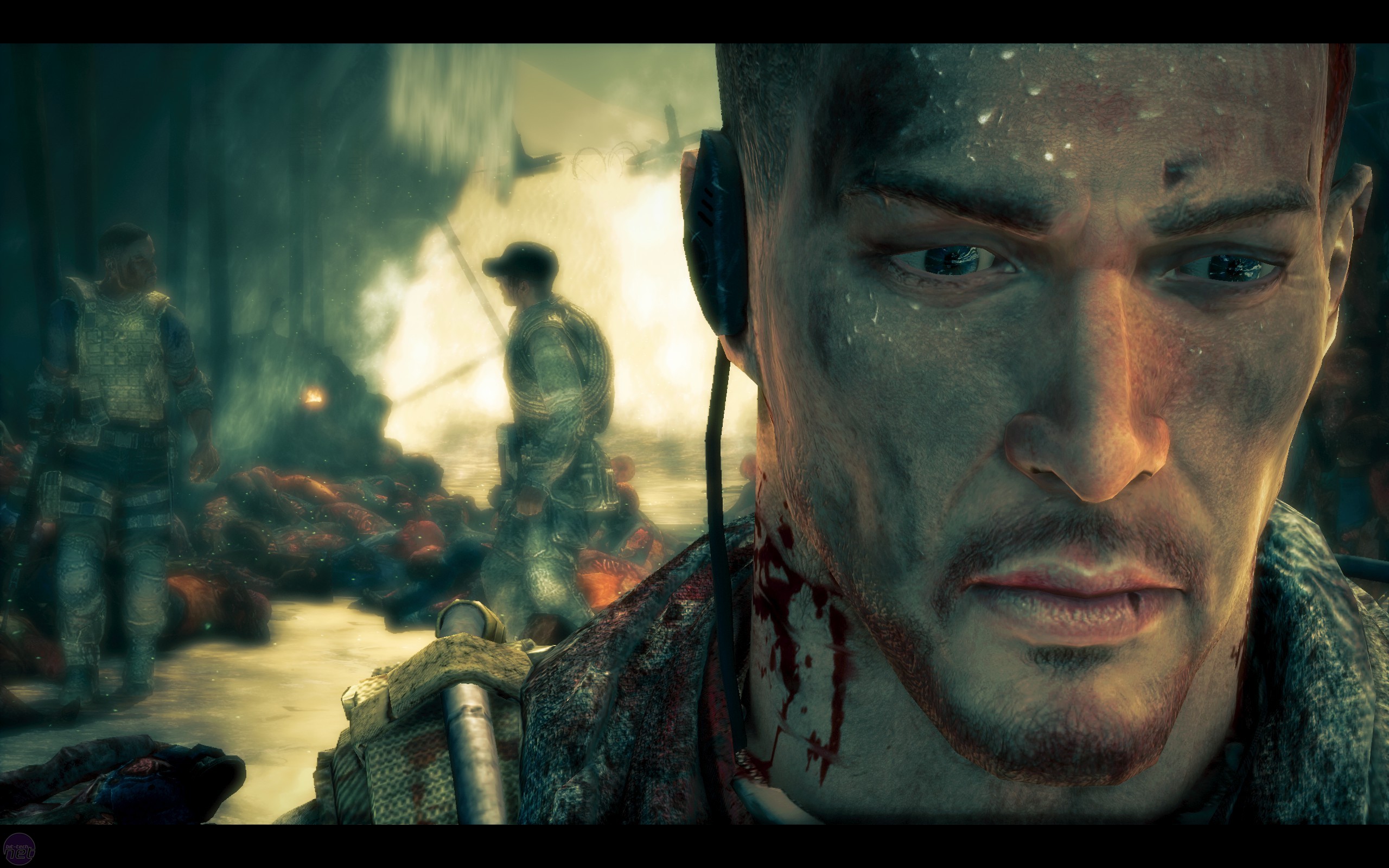 |
| Main character from Spec Ops : The Line |
I aimed for something fairly contemporary to suit the working environment.
I've been using this tutorial to try and learn how to generate low poly hair for a game environment using alpha
maps.
http://www.paultosca.com/varga_hair.html
I've never modelled polygon hair before, and I have always been put off by experimenting with alpha maps, so I ended up leaving this till last when I probably should have tackled this earlier. I attempted to do quick hair models and alphas in Maya which turned out alright, but the problems occurred when I attempted bring the final hair model into Marmoset. It was problematic trying to get the alphas working properly on the character.


After much troubleshooting, unfortunately I found out that alphas don't work too well in Marmoset. I had to use aplha testing as I couldn't get the alpha blend mode to work properly, which lead to choppy aplhas on the hair.
 |
| End result of adding the hair in Marmoset. |
Head Modelling
Tying to fix these head proportions. I used the base head texture of one of the characters to form the other as I was in a rush to finish. The male head looks a lot older than what I had wanted it to be, and the proportions are still off, but its not noticeable enough to go back and make changes at this stage.

With no time to retopologize these heads, I've just added the lower subdivided models onto the characters and bakes the normals onto them instead. It will mean that the heads aren't properly optimized for the game environment, increasing the polycount above what it was meant to be, but it is still low enough to easily bring it into Marmoset. This also means that I can easily adjust the proportions in small areas when the character is finished in case something is slightly off.
I'm not going to have time to model the 3rd character at this stage.
Baking and Texturing
Baking and texturing the accessories is taking longer than I expected. I am having to do each section, such as the limbs, accessories, and head separately to keep the textures clean. Though I had to adjust the low poly mesh slightly, it didn't take me long to UV map the torso. However, I needed to remodel the limbs and accessories as I made them in Maya without making a low poly version. I was also having problems with the head model which I sculpted from scratch in Mudbox.
I used this short youtube tutorial to familiarize myself better with the interface and tools : http://www.youtube.com/watch?v=UGKsbh9vw2Q
Transferring the paint layers
As I painted on top of the Mudbox sculpt, I had to use PTex to paint as the UV's were not set up properly. Transferring the paint layers onto the low poly mesh meant that some sections were not aligned properly so I had to adjust them in Photoshop. Next time, I will paint directly onto the low poly model to avoid this.

Painting a specular map in Mudbox was also quite tedious as I was unable to see the shininess of the textures easily. Applying the specular map to the accessories on the character make the varying material of the objects on the character stand out a lot more. Details such as the buttons and buckles stand out a lot more as the light rotates around the character. Turned out much better than expected.


Finally, I added smaller decals to the character. One of the traits of the group was that they were to be an organized bunch, which I was supposed to show through numbered and labelled clothing as well as consistent uniform colour. The whiteness of the number and labels added well needed contrast the the character so that the overall tones weren't too dark, and emphasized character role and placement within the group through the labels; The role "Linker" being No.04 of the group in particular.
The model is currently around 9000 tris so far, but it looks much higher than that, which I'm really happy with.
I have also added the hexagonal pattern onto the floor as I picture the dome environment they work in being very similar. The ground looks very advanced, and conforms the the aesthetics of the characters. The reason I modeled the feet in a very fragile way is because the environment itself is very fragile. The hexagonal floor, also being very unusual, should spark curiosity to what the environment is like for the viewer.
Marmoset Toolbag
I will be using the Marmoset engine to render out my characters. I had been looking at Marmoset ever since year 2, but I have never gotten round to using it. The program makes it easy and simple to render out models in real time and is used by many industry professionals to render out models without having to spend a lot of time setting things up and rendering them out.
http://www.marmoset.co/
Spending a short time learning the tools for the trial version, I did a test to render out a small portion of my character and got amazing results quickly. I won't need to waste time learning how to get nice looking renders out of Mudbox or Maya, however I will need to set up the character and textures properly before I can import the whole model. If I have time to rig and animate the character after the hand-ins too, I can display the character animating in an idle stance.

As Marmoset can only render one .obj file at a time, I need to set up the character so that it is labelled and split properly into chunks before I export the obj. I also want to bake the ambient occlusion from Mudbox onto the low poly model as it gives the textures a lot more depth, where as Marmoset's ambient occlusion isn't as flexible.
When I finish everything properly and add proper posing and lighting, I'm hoping to expect some amazing results.
Friday, 10 May 2013
High Polygon modelling in Maya
I have been modelling the hard surface sections in Maya. I'm hoping that when I bring it into Mudbox, it will contrast will with the organic sculpted clothing. I've only started working in high poly in Maya last summer for a short while and I have no idea if it will translate well into mudbox. Even then, I never got to the stage of baking the normals of the high poly versions before.
 |
| A little preview of my maya contruction line.... |
Sculpting Character 2
I'm currently sculpting the second character. It is taking me a lot less time to sculpt than the Scout character as I am reusing the Limbs and using the trousers as a base to model off of. I do however need to change the proportions as this character is male, and needs to be bulkier to suit the role of "Grunt" rather than the sleek and agile "Scout". The angular look of the clothing is a lot easier to pull off now as I am more used to the tools. I really like the look of the angular sections of the body, but its going to be covered up by the armor on top. Feedback from fellow Computer Artists did however think that the top looked too rigid, as there were no visible cloth folds unlike the trousers. I'm hoping the armor will hide this, as I don't have enough time to add them in. The cloth folds on the trousers around the crotch also seemed a bit too sharp which made it look like it was bulging inappropriately from the front.

Like the previous model, I modeled the hard surface areas in Maya to generate a smoother, precise model which contrasted with organic cloth. I deleted portions of the shoulder pads to allow for more movement. As I modelled many sections of the low poly model in tris, such as the shoulders and armor, I was really worried that it would not subdivide properly to give that smooth feel to it, but after carefully adjusting the topology and adding more edge loops, I managed to get it to subdivide the way I wanted.
This was the result of the high poly armor brought into Mudbox.

At the rate I am working at, I am doubtful that I will be able to get the third character in. I think I will work on finishing 2 textured characters to demonstrate how colour works to unify them both.
Sculpting Character 1
Finished the high poly sculpt for the "Linker" Scout character. Though I have sculpted before, I have never been this far with a character in this much detail. I did sections such as the limbs and shoulder pad in Maya to get a crisp, precise look that would contrast with the sculpted sections.
This ended up looking better than expected. The shoulder pad was also slightly changed to a more curved, ergonomic shape to make it look more functional rather than completely decorative.

Links
Trying to lay the decorative hexagonal "scarf" in a smooth, lowing manner was tricky. I attempted to do it manually by duplicating each hexagonal object and laying them out separately, but it didn't look too great. Instead, I looked back to a technique that I had only ever done in a second year tutorial. By creating a motion path, I attached the single hexagon to the start of it and created an animation snapshot of the object. I then joined them together to get the resulting effect. I did have to adjust a fair amount to get them orientated correctly though, so i will have to go through it all again if I am to change the proportions or pose the character.
Trying to lay the decorative hexagonal "scarf" in a smooth, lowing manner was tricky. I attempted to do it manually by duplicating each hexagonal object and laying them out separately, but it didn't look too great. Instead, I looked back to a technique that I had only ever done in a second year tutorial. By creating a motion path, I attached the single hexagon to the start of it and created an animation snapshot of the object. I then joined them together to get the resulting effect. I did have to adjust a fair amount to get them orientated correctly though, so i will have to go through it all again if I am to change the proportions or pose the character.

Feedback from students and 3D forums suggested that the link scarf design seemed to look as if it would fall off the shoulder, as well as the different materials on the character not being obvious enough. Large changes to the design would be too time consuming at this stage, so I modelled a belt around the back to hold the scarf to the shoulder. Its not the best solution, but it should be better than leaving it hanging.
Though the proportions do looks as if the character is quick and agile, something still seems wrong. Will need to work on the head and limb proportions, and model the feet.
Subscribe to:
Comments (Atom)