Tuesday, 11 December 2012

Character Torso

I think I'm going to call this media test finished....
I quickly cleaned up the torso from the previous sculpt. I should have the base sculpts to begin morphing them into the body types I need for my final characters. They should act as a good base to start modelling over when they are shaped into more appropriate body types...


Saturday, 8 December 2012

Weapon design


Here is a little section on how I came up with my weapon designs...

Weapons and accessories can play a large role in defining a character. Some characters are not only known for their appearance, but also their abilities. What they use must reflect their role in the team, and can change a character's silhouette for better or worse.

Here are some rather unique weapons what are connected with some rather iconic characters...

Gears of War Lancer. Known for its brutality which  reflects the bloody nature of the combat in the game.
Kingdom Hearts Keyblade
Dead Space Pulse Rife. A common yet unusual looking design in the dead space universe
I wanted the weapons to look very cheap, but futuristic. I drew some inspiration from Hawken (PC), where the weapons looked both futuristic and mechanical, as well as past weapons. 

Though the weapons design in Hawken were large and clunky, there were a lot of elements I liked about them. They had a very bare, mechanical aesthetic that I wanted to bring down to a smaller level. 
I drew up some quick sketches.


I also designed a larger weapon for Character 2, suitable for flight, yet effective at fast speeds. I'll probably attach it to the character permanently as his design doesn't call for him to function outside his military duties due to his extensive modification. 


Helmet Design

I thought that maybe an open face mask would be able to make character 1 more memorable instead of looking like a faceless soldier. Though this will require quite a bit more rigging.The idea is that the full face plate opens to the top and side to give better vision for the character. When closed, sensors on the side are used for vision and is projected inside the helmet. Here is a quick paint up of the design. I am hoping that when open, the helmet will add to the characters, already tall profile. 


Additional Characters


I designed a fairly standard character to show the form of the standard uniform. He looks slightly tattered, but overall he looks fairly normal and generic.


Many games also have a character whose role is to act as the "tank" of the team. This character is often large and heavy, does incredible damage, but is also incredibly slow. I decided to design a character that would fit into this archetype. With a large body frame, the character would have to be heavily armored and armed. 
The "Tank" design took the initial uniform and fitted it onto a larger body, and adding additional armour. I added a railgun looking weapon as well as adding a thick front section to the head. Though this worked successfully in games such as Brink and Killzone 2, the aesthetic did not suit the cheap mechanical look of my own game environment.  


If there is one thing that I want to remain consistent in my team, it is that all the characters must look cheap and unhealthy as I want it to be part of their group identity which reflects the harsh wasteland that they live in. 

Team Colours


Colour is one of the more important factors when identifying allegiance in characters. Whist reading about read hierarchy of characters in a paper about Team Fortress 2 character design, I found out that colour was often used to distinguish between teams when a player is in close proximity to an ally or enemy. 
Though not having designed characters for the factions enemy team, it was important to start some colour tests to show that if an opposing team was encountered, it was easy to tell them apart. 


The 2 pallets I came to be satisfied with contained colours that both blended in, yet contained colours that stood apart from the others. With more arcade like games, strong, predominant team colours that often stood out from the background made the characters easy to see. However, aiming for a more realistic atmosphere, red team and blue team's colours were less obvious against the background so that they blend in, but were easily identifiable once seen. Both pallets contains organic colours from the environment, and some artificial colours. Some were shared between both palettes to show some kind of consistency so that they both seemed like they were from the same universe.

Helmet Design 1


Here are some simple sketches for helmet designs. I wanted to create some rather unique designs as the head is one of the first places an individual looks.  I based the designs on some well known social roles in team based shooters, as well as making my own,

Designs : Engineer, Assault, Underwater specialist and Officer

The underwater specialist and officer are social roles that are not really used multiplayer games, but may be rather interesting if implemented.

Wednesday, 5 December 2012

Character 3 Refined Design

Here is the finished painting for the refined design for "Amputee Soldier". 

There are many elements of the design I do like, such as the helmet, and weapon, but there is nothing exceptionally memorable about the character. He does look a little more generic now, and though I'm pretty set on using that colour palette, it doesn't help in making him more memorable. 


I think the design of this character can be worked on more to make him more memorable before he is brought into 3D...

Character 3 Refined Design


Working on a detailed painting of character 3 : Amputee Soldier. I have written more about him to give him a little more personality and background. I've been using the Feng Zhu tutorials as a reference to hopefully improve my digital painting skills too.

http://www.youtube.com/watch?v=eKndZHlcgFE
http://www.youtube.com/watch?v=meIOValetZw


Role : This character is an engineer. Ranking just above grunt, he lives in isolation from civilization. Left to himself and his mechanics, he is forced to amputate himself from both war and personal injuries. He lives on the plains and avoids contact with outsiders. Skinny and starved, his clothes are ragged and his weapon has been modified by removing most of the unnecessary pieces to make it lighter for his already fragile body to hold.

Monday, 3 December 2012

Feng Zhu Tutorials


I've been watching tutorials from Feng Zhu. He provides a lot of useful insight into character design, as well as useful techniques for concept drawing.

http://www.fengzhudesign.com/


Feng Zhu Concept Art


Character 3 Variations

"Amputee Soldier"

Continued working on some thumbnails for the 3rd character in the silhouettes. This silhouette was interesting as it contrasted with the large powerful outlines of the previous two. The zombie like, fragile appearance was quite refreshing, especially when a games protagonist often consists of  large, strong male characters. The outline also fitted well into the planned environment, showing the effect the harsh climate can have on an individual. 

The silhouette implies that the character is low level, with a stance that doesn't seem very threatening as a person, yet seems dangerous. It was very mechanical looking, so I wanted the character to be heavily modified with mechanical limbs and such. 

ANALYSIS

All designs were based off the engineer archetype, as a player will most likely link all the mechanical parts to some kind of mechanic role. Similar to a Demo man having a blown off arm, or a medic carrying a syringe, a player will hopefully recognize the characters enhancements as his own work. 
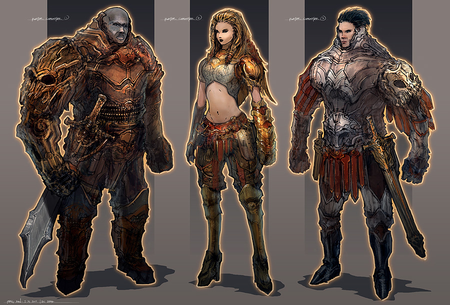
Design 1
Though I am not too fond on these 3 designs, this is the one I think is the strongest, although not by much. The mechanical leg and arm works well, and so does the radio like antenna on the back, but the rest seems fairly uninteresting and generic.  

Design 2
I think the open mechanical rib-cage and helmet works well in this as they seem quite unusual, however it does make the character seem entirely robotic. The rest of it was rather rushed as I could not think of a suitable design for its place. 

Design 3
The third design is my least favorite. I tried to give him a tacky looking gas mask similar to the one on Character 1, however it doesn't seem to look or fit right. The armour around his upper torso doesn't seem very functional and the pouch on his stomach seems out of place. 


This is the current design I have of "amputee" soldier. I have taken the elements I like from these thumbnail sketches and have added a helmet design from before. 
I aim to have a more detailed, finalized design soon. 


Friday, 30 November 2012

Officer Designs 2

I have been working on more variations of the first character silhouette. Firstly, I combined the sections that I had liked an the initial versions to see if they worked together. I liked the outcome, though I'm still unsure about the helmet. The human legs also make the character a lot less interesting. 


I also wanted to design an officer like character, as the pose seemed to fit. The design would be intended as an elite looking model for characters to show their high skill level. The uniform would look a lot more clean and well kept as an officer would have to represent discipline and good maintenance in the battlefield. Armed with only a long, elegant pistol, the officers role is not a fighting one, but one to ensure the the troops are in top shape. A thin, well fitting, and smart coat stands out from the skinnier, less fortunate ground infantry under her command.

Tuesday, 27 November 2012

Standard Uniform Design


Drew some sketches of the standard battle uniform. Nothing that unique, but it conveys an interesting uniform design. I probably wont stick to it though. 


Design 1 - Male
Loose, dirty, cheap, light.
Rags loosely wrapped around body to keep warm.
Bandages that cover battle wounds

Beige, brown and red uniform caked in mud.


Design 2 - Female
Loose towards torso, thinner towards hands and feet. High tech. Light.

Round shaped pockets.

Fast and agile.

Character 1 Variations

CHARACTER 1

I decided to work on the variations from the initial silhouettes as they seemed to most visually appealing. The variations of size and shape made them look individually unique, however the dirty, robotic like aesthetic remained consistent throughout all of them. 


I have done 3 variations on the first silhouette, trying to fit into the futuristic, yet dirty trench warfare environment I had pictures for these characters. Working only in tones, I tried to block out the basic shapes of the character, as well as form different variations on equipment and uniform that would enhance their silhouette.
ANALYSIS


Design 1
Role: The role of this character is more iconic than functional, with the main task of carrying the flag that represents the team. Similar to a soldier who carries the colours, her function is to act as a rallying point and as motivation to move forward into battle. The characters role requires patriotism and bravery to remain elegant in battle.

No change was made to the original silhouette. The helmet, inspired by WW1 era gas masks and the tattered flag and rags try to convey a futuristic, harsh and dirty landscape. I believe the first silhouette also works well as the clear view of the flag and the pose itself is very tall and grand which suggests elegance and pride for what the team is fighting for, despite the harsh climate. However, the mid section looks almost tribal to me which does not fit in well. 

Design 2
Role: More functional than design 1, this character's role is to provide quick recon. Lightly armored and armed, but provided with superior optics means that this character is useful for quick hit and run and observation. She fits into the "scout" role found in most class based shooters. Wing like objects on the back also suggests limited flight capabilities. 

I decided to change out the legs for a more humanistic look. The helmet is a lot more high tech, though I think it may not look "cheap" enough. The wings also make the silhouette a lot more interesting, which is needed without the flag. 

Design 3
Role: The melee type class . The speed and agility of the character allows her to get close to the enemy to strike. Slightly more armored than the other 2 designs, she still remains light enough to move fast. The helmet provides additional face protection. 

Though I think the character looks visually interesting, with the sections coming out from the back of the head trailing behind when the character runs, I think it looks too alien in design. Feedback compares the design to "Predator". The character looks far too advanced as I am aiming for a futuristic, but cheap look. 


Officer Designs


I thought I would do more variations of the officer role...


Captain Lionheart
Casual Officer - High trousers. Sweatshirt. Officers hat.
Personality - Casual and uncaring.

This character uses his rank as an excuse to get people to do his own work for him. Despite his name, he is cowardly in battle and is generally not cut out to be a leader. His only reason for being in his rank is for the pay, and there is little else he cares for.


Captain Blackheart
Strict Officer - Fearful appearance, Large coat that covers smart uniform.
Personality - Fearless

This character has seen many years on the battlefield. Strict and merciless, he shows an iron fist when it comes to discipline and is feared by both the enemy and his own men alike....

Saturday, 17 November 2012

Character 2 initial design


Thought I'd post the original sketch for Character design 2. A lot of the elements have been transferred over to Character 1, but the role remains the same. However, due to the new silhouette, most of the elements where changed, including the sex, size and accessories of the character. 


Saturday, 10 November 2012

A little look at Hawken


I've been playing the Hawken beta recently and I was fascinated by the art of the game. Though there was little to no character design in the game, the design and detail of the vehicles and environment amazed me. Of course, the UDK engine can show off some really nice models, but the design of the environment really felt unique. Of course there have been many mech games before, but the level of detail and visual realism really make the experience a lot more immersible. The mech customization and class system also interested me. Each class was not limited to only one type of weapon, but were given a variety of weapons that fit their class type. It was up to the player to find out what worked and what didn't. Combined with the choice to customize the appearance, it really made me feel as if my vehicle I was piloting was "my own". Hawkens customization is far extensive, but combined with the beautiful visuals, it feels appropriate to mention these things...

Moodboards

SETTING

The game environment the players will be designed around will be set in a dystopian future where armies fight over food and water supplies. A large, starving population fights for resources with cheap, mass produced equipment and tacky electronics. Environments consist of large shanty cities spread through large muddy plains devoid of plant life. 

CHARACTERS
The population is heavily militarized. Though there is one central army, but it is heavily separated throughout the plains with each city's occupying army seeing themselves as their own military rather than a whole. There is often conflict between cities as the protectors swear allegiance to their own city and are unwilling to help others. Characters rely on cheap, mass produced equipment, and tacky cybernetic implants to fight. 


STYLE

The game environment will be inspired by WW1 trench warfare. Buildings will be tall and dirty, holding a large populous in a tiny area, such as the Kowloon walled city. The environment will also be futuristic, though it must look cheap enough to fit in. 

Tuesday, 6 November 2012

Digital character painting.


I'm doing some colour tests on this character. The torso is quite dark in general which will hopefully draw attention to the mask on the head which stands out because of its light tone value. This will be useful if the mask of the character is a unique element that is not found on any other archetypes which will allow the character to be quickly identified. 


I'm using a lot of FZD tutorials on Youtube to learn how to paint better in Photoshop. I found them whilst creating concept art for projects last year.They are incredibly useful and I am learning a lot.
http://www.youtube.com/playlist?list=PL88CAD6C0E7F721F5

Wednesday, 24 October 2012

Detailing Practice

Once I finish detailing with one of the previous Silhouettes, I will begin experimenting with Colour Theory within characters.

1. Red - anger, evil, love, hatred, blood, hot, active, emotional
2.Orange - warm, danger
3.Yellow - excited, happy, light
4. Green - organic, rich, digital, gross, sickly, money
5. Blue - friendly, sad, diffused, calm
6. Indigo - royal
7. Black - evil, fear, cool, empty
8. White - Heroism, holy, cleanliness

Abstraction of Shapes

I have been reading the Abstraction of Shapes in Characters from "Character design from Life Drawing" by Mike Mattesi. I have been looking at emotional ties with certain shapes...

Triangle: Athletic. Dynamism. Precariousness. Solidity. Dynamic. Force
Circle: Friendly, Soft, Safe.
Square: Strength. Solid.

I have also been looking at the law of thirds. "Our minds want to create symmetry and the irony is that this causes disinterest in art. Contrast creates interest."


"The law of thirds can also pertain to the dynamic shape of the triangle. The number three is a powerful number. In general, you want to stay away from even numbers because they have a tendency to create symmetry. The number one does also. Between the forceful triangle and the rules of thirds, you should be able to create dynamic designs if you so desire."


I have attempted to use these techniques on a new set of silhouettes. By creating a varied set of silhouettes using abstract and forceful shapes within the silhouette, I have tried to evoke certain emotions within the shapes of the characters. 

Friday, 19 October 2012

Écorché Study

Why am I doing this?

  -To improve my sense of human anatomy.
  -To create reference material for project
  -To act as a base for modelling different character builds

Using the mudbox default human mesh, I have been sculpting from it to create a muscular reference for future projects. It is only around 1/4 complete at this stage.


Current Progress

- Proportions need to be fixed
- Forearms, calves, hands, feet and head still need sculpted
- Muscles need to be better defined


Semester 1 Pitch Week

Just adding some content from pitch week which I probably should have put up a lot sooner...

The Project

Domain: 3D art and Design / Games
Topic: Character Design for games

Identifying a characters team is significant when it comes to games that include different factions. This is vital in combat games where the player must make split second decisions. Identifying whether  or not a character, player or AI controlled, is friend or foe contributes highly to the players chance of winning.
Furthermore, it is essential that this element is not overlooked as the information they read from a character will contribute highly to the players decision making. This is crucial in competitive online multiplayer games. 


Designing a character to fit a stereotype…
I will be looking at how different stereotypes are often linked with various physical attributes. 
Games often use archetypes as it allows the player to determine a characters abilities based on what they already know, and how mixing them up may create interesting results. Character Personality also plays a large roll in games as it determines the players relation with the character.

-What are the differences in 2 dimensional, and complex character personalities and their effect on a player?

-In what way can the characters personality be shown through its design


Team Fortress 2 - An example of a team with varied and interesting archetypes

What I need to Improve on...

- 2D concept art creation
-Texturing
-Hair/Fur
-Shaders
-Rendering

-Anatomy


Pitch Week Reflection

Feedback about the overall progress of the project was fairly positive. It was suggested that I not only look into games for reference, but also cultural identity, military squads and sports teams. Looking at real life examples would greatly improve my research. I should also continue to make many more, varied and interesting silhouettes and experiment with different themes. One of the main issues that came up was that my plan to rig the character models for the final project was not justified so I will need to show reason to why I am doing it.

Wednesday, 3 October 2012

Character Archetypes

I've recently taken interest in the hl2 mod NeoTokyo on the PC. The design of the characters and environment really interests me. Taking elements from Ghost in the Shell, it paints a very beautiful futuristic setting. Being an online multiplayer game, the design of the character classes needs to be very well thought out. The player's team is clearly shown through the color schemes for both factions and class is identified through a verity of different archetypes. Characters with more health are shown as larger characters outfitted with amour to show that they are slow and strong, whilst faster, weaker characters are often smaller and carry less to show maneuverability.

Tuesday, 2 October 2012

The Importance of Silhouettes


Practicing Character Silhouettes 
In competitive multiplayer games, it is sometimes important to be able to identify other players against the scenery quickly. It is essential for, some types of games, that information such as player team, class, weapon, and rank must be quickly identified for the player to make quick decisions.  
When designing characters, certain design elements must be prioritized in an order in which the player reads them.The silhouette of a character is the predominant element when identifying a character at range. Through the use of unique and contrasting outlines, the player can extract much information from the character.


I created my own character silhouettes today, trying my best to create unique and varying styles of character, and linking them with similar design elements. The top three have robotic elements to them which make them seem like they belong together. The bottom two, however, did not feel as if they belonged with the rest as they felt too human and chunky which is why I separated them from the rest. Overall, I am pretty happy with the results but there is still a lot of room for improvement. 

Thursday, 27 September 2012

Team Building


A question that I may want to explore :
How can a set of characters become recognized as part of a group or team?
             
Unifying design elements can show character relation.
                  -Logos
                  -Aesthetics
                  -Colour 
                  -Pattern

What makes a good design aesthetically pleasing?
                -Silhouette
                -Iterative process
                -Shared Vocabulary : overt references
                -Shared Vocabulary : subtle references
                -Pattern Recognition
                -Scale
                -Pose
                -Mixing influences
                -Putting a twist on a familiar idea
                -Focus attention with contrasting detail
                -Symmetry & Asymmetry
                -The Uncanny Valley     

Sunday, 23 September 2012

Lets get this thing moving!

Might as well start this off by adding some stuff I had started over the summer.

As I am interested in 3D character modelling, I started with a high-poly hard surface modelling project of some sort of robotic leg. Quite happy with the final design. I may work it into a full character in the future.


There were problems when the leg tried to bend past 45 degrees and resulted in huge gaps in the knee section. This was a problem that I should have noticed when initially drawing it up but I was in a hurry to get started. I wanted the leg to be flexible so it had to be slightly modified to allow it to turn further.

Similar to armor in the middle ages, I ended up adding two metal sections that folded into the thigh and calves to help keep the shape when the leg bends without having the sections deform.


If I find time in future, I may try to bake it onto a low poly mesh, texture and rig it.


A little bit of Engineering


Accidentally deleted the post so I'm just adding it onto this one...

Another project I was working on was a female sci-fi mechanical engineer. I had wanted to get the entire thing finished over the holidays, which included sculpting, baking normals, texturing and rigging. Unfortunately I had only got a fraction of it finished as I had started again and had been travelling a lot. After my initial sculpt, feedback I had gotten online was fairly good, however my anatomy and cloth folds on the clothing needed improving. They recommended that I start again by sculpting a body underneath and then using it as reference for sculpting on top. They also pointed me to some good references on cloth folds.
Sculpt of the body for reference

After I went and redone it with the proper references and body, there was a notable improvement.
I had only worked on the trousers for a while and the rest was not even started but the overall quality was better than that of the earlier version. 

Sculpting the trousers with proper cloth references
The design was to contain a rather baggy set of trousers which tightened towards the end of the limbs, with a large jacket that did the same. I didn't manage to start the jacket. 


Some useful resources

From Polycount wiki :

http://wiki.polycount.com/CategoryCharacterModeling
http://wiki.polycount.com/CategoryReferenceAnatomy

http://www.polycount.com/forum/showthread.php?t=61079
(a good thread for deformation in low poly objects)

http://wiki.polycount.com/BodyTopology

Figure Drawing :

http://www.drawsh.com/